By Joe Smith
Special to the Record
I have always found typesetting a fascinating part of visual communication.
With today’s technology, there is a vast selection of different typefaces which can be quite confusing or intimidating when trying to design a website, brochure or even an ad in this newspaper.
It may seem like a matter of personal preference but research has shown that typefaces and their fonts can dramatically shape your communication and how people actually read.
Typographical scholar Beatrice Warde observed that fonts not only embody style, emotion and authority they are in fact the clothes that words wear. And when you think in those terms we all know that the way we dress speaks volumes about who we are as individuals. Warde, by the way, made a name for herself in the early 1900s as one of the very few women working in the field of typography. Her comments still resonate more than 100 years later.
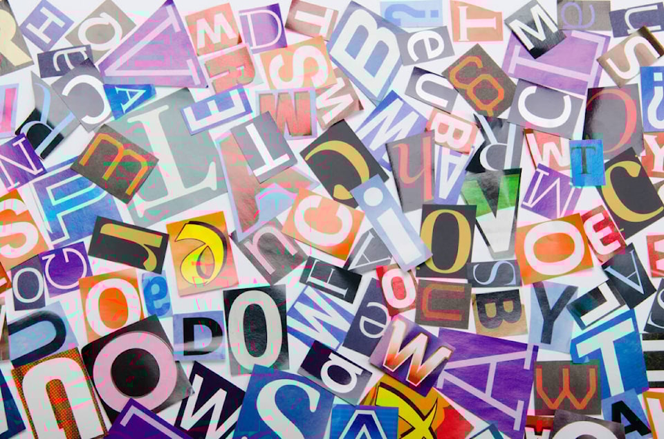
Before continuing here are a few basics that will help clarify some terms. Typeface is the basic design of the letters, numbers and symbols while a font refers to the variation in width (e.g. condensed), weight (e.g. light, bold), slope (e.g. italic), size (10 pt., 14pt.) and so on.
While typefaces have developed tremendously over the years especially today when changes can be made at the push of a button, there are some basic principles that must be kept in mind when making a choice. The first is legibility, followed by readability and aesthetics.
Legibility is concerned with how individual characters can be distinguished from each other. Readability refers to how the text can be read as a whole and aesthetics is the core design principle that involves visual elements such as balance, movement and shape.
There are two basic groups of typefaces serifs and sans-serifs. Serifs like Times New Roman or Garamond are considered best for long text passages while san-serifs like Helvetica or Arial are more often used for headlines or short blocks of text.
There are many studies that have been conducted to find out how people respond to different typefaces. In one study by Adobe to determine reading speed, each participant read the same selected long passage, 300 to 500 words, but set in 16 different typefaces.
What it found was that Garamond, Helvetica, Calibri and Times were at the top with scores ranging from 312 wpm to 277 wpm. It also discovered that age factored into the equation with reading speed dropping during middle age and different typefaces performed differently for young and older readers. For example, Garamond was better for older readers while fonts like Helvetica and Arial were better for younger users.
This just touches the tip of the proverbial iceberg. It takes a bit of research to choose the right typefaces for your message but there are a few things to remember. Keep it simple by limiting the number of typefaces and fonts you use. Too many makes your message confusing and unattractive.
Typesetting is an art and merely choosing a typeface because you personally like it might not bring the results you want. However, choosing the right one can go a long way in helping to get your message across.
Joe Smith is a communications consultant and an accomplished fine artist. He can be reached via email at joesmith@shaw.ca